Bike Sharing Project
Summary
This project aimed to expand my Excel proficiency through non-financial data analysis. Focusing on bike-sharing performance, I worked to understand daily usage patterns influenced by multiple factors such as weather, time, and day type. The main challenge was identifying which variables were most relevant and determining how to apply them effectively in the analysis.
Environment
- Excel
Sources
Scope
Defining the Focus I began by identifying the key objective of the project: showcasing the overall performance of bike sharing. - To support this, I prioritized selecting data that most directly influenced usage patterns. After formatting and cleaning the dataset, I gained a clearer understanding of how to leverage the available variables effectively.
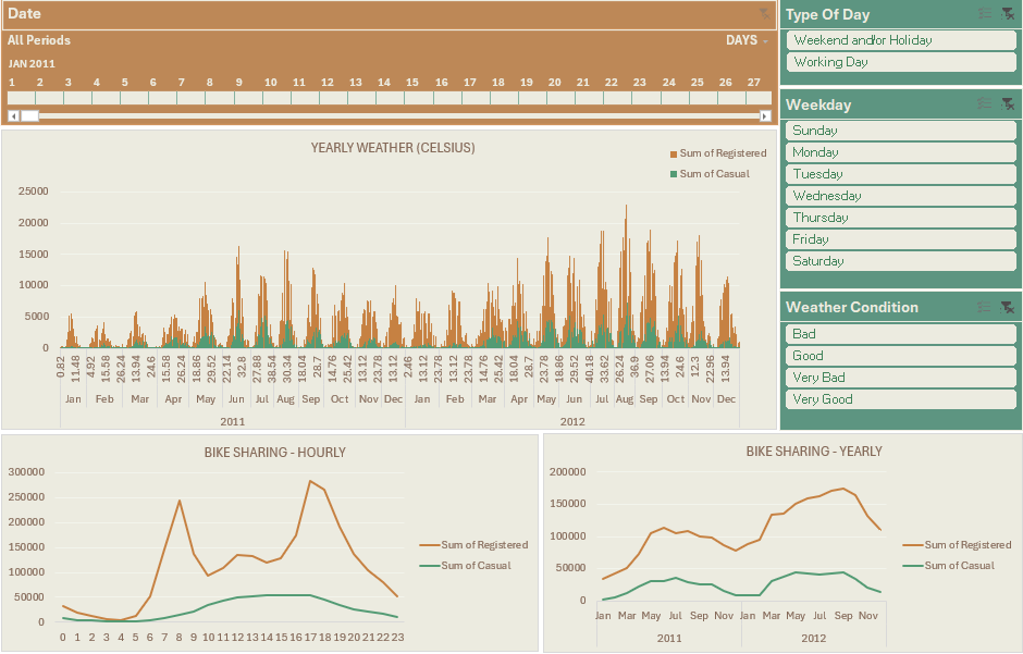
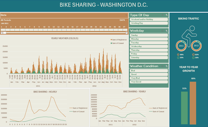
Dashboard Design Strategy For the dashboard, I aimed to balance broad insights with granular detail. - This included integrating yearly overviews alongside more specific dimensions such as day types, weekdays, weather conditions, hourly traffic, and daily/hourly weather. The challenge was presenting this diverse data in a way that remained clear and visually engaging.
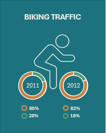
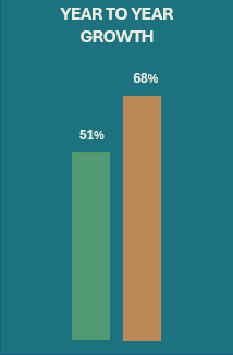
Final Integration & Visualization In the final stage, I incorporated yearly weather trends, hourly and yearly traffic data, and interactive elements like slicers and a timeline to enhance user exploration. To round out the dashboard, I added personalized visuals including: - Donut charts to show the percentage of yearly bike sharing by user type - A static visual to highlight year-over-year growth
Steps
Data cleaning
Data cleaning summary
Reviewing original data information accuracy
Minimal cleaning was required overall.
Data Correction:
- Seasonal data was reordered to reflect the correct chronology, ensuring accurate time-based analysis. See Dataset Infos sheet
- Converted temperature, humidity, and wind speed from normalized values to readable formats using multiplication adjustments.
- Reformatted date values
Formatting
IF function
-
Season from 1,2,3,4 to Winter, Spring, Summer and Fall =IF(C2=1,“Winter”,IF(C2=2,“Spring”,IF(C2=3,“Summer”,IF(C2=4,“Fall”,“Error”))))
-
Weather Condition from 1,2,3,4 to Very Good, Good, Bad, Very Bad =IF(J2=1,“Very Good”,IF(J2=2,“Good”,IF(J2=3,“Bad”,IF(J2=4,“Very Bad”, “Error”))))
-
Also formatted Year, Weekday, and Type of Day
Dashboard
From Pivot Tables to Pivot Charts
- Yearly Weather
- Hourly Traffic
- Yearly Traffic
- Yearly bike sharing in %
- Year on Year Growth (fixed “chart”)
Slicers and timeline
- Timeline
- Weekday
- Weekend and/or Holiday
- Weather Condition
- Very good - Clear | Few clouds | Partly cloudy
- Good - Mist & Cloudy | Mist & Broken clouds | Mist & Few clouds | Mist
- Bad - Light Snow | Light Rain & Thunderstorm & Scattered Clouds | Light Rain & Scattered Clouds
- Very Bad - Heavy Rain & Ice Pallets & Thunderstorm & Mist | Snow & Fog
Analysis
I could conclude a few things by quickly looking at this dashboard.
-
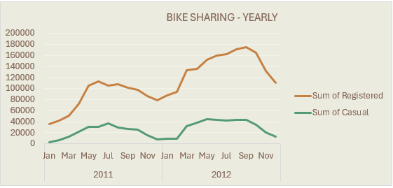
The overall ratio of casual and registered traffic between 2011 and 2012 hasn’t changed significantly with a 2% increase of registered usage.
-
The growth in the amount of usage between 2011 and 2012 has known a significant rise with 51% and 68% respectively for casual and registered bike sharing.
 ⠀⠀⠀⠀⠀⠀⠀⠀⠀
⠀⠀⠀⠀⠀⠀⠀⠀⠀
⠀⠀⠀⠀⠀⠀⠀⠀⠀
- Registered users commute with the bike sharing service for work and they represent the vast majority of users. As we would expect, registered users mainly use the service to commute for work. In contrast, casual bike sharers use renting bikes for leisure. The curve of bike traffic for casual users is steadier and its distribution varies between weekends/holidays and working days. Factors of influence like weather and events (not in the report) will have an impact on traffic as well.